Your party invitation design sets the tone for the entire event. A well-designed invite builds excitement, communicates the vibe, and gives guests every reason to show up. Whether you're planning a birthday, a wedding, or a casual backyard get-together, the way your invitation looks and reads makes a real difference.
Why Party Invitation Design Actually Matters
Most people make a decision about attending an event within seconds of seeing the invite. A Nielsen Norman Group study on first impressions found that users form visual opinions in under 50 milliseconds. Your invitation is no different. If it looks cluttered, off-brand, or uninspiring, guests won't feel the excitement you want them to feel.
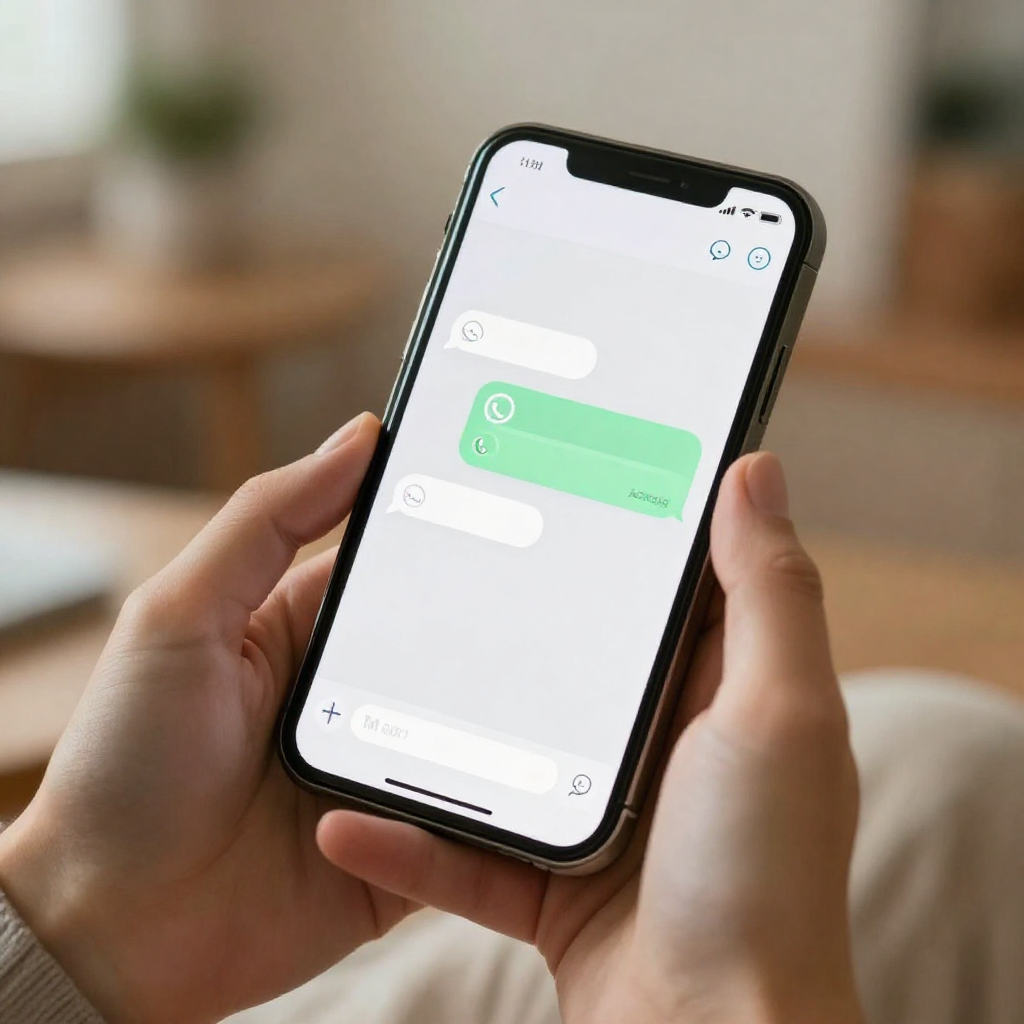
Digital invites have raised the stakes. People now receive invitations on their phones, often through WhatsApp or social apps, where they're already surrounded by polished visual content. Your invite needs to hold its own in that environment. A sharp, creative invitation signals that the event itself will be worth attending.
Start With a Clear Visual Concept for Your Party Invitation Design
Before you open any online invitation maker, decide on a visual concept. This means picking a colour palette, a tone, and a general aesthetic that matches your event. A neon-lit club birthday calls for something totally different from a garden bridal shower. Getting this right first saves you from redesigning everything halfway through.
Stick to two or three colours maximum. Colour theory research consistently shows that limited, intentional palettes feel more professional and more visually appealing than busy, multi-colour designs. Choose one dominant colour, one supporting colour, and one accent. This keeps your invite looking clean without being boring.
Match the Aesthetic to Your Event Type
Think about what your guests expect when they picture your event. A graduation party invite ideas board might lean toward bold typography and school colours. A baby shower invitation might use soft pastels and illustrated florals. Let the event drive the visual choices, not the other way around. You can explore birthday invitation templates on Invitofy to see how this plays out across different styles.
Choose Fonts That Are Easy to Read
Font choices kill more invitation designs than almost anything else. Script fonts look elegant in small doses but become unreadable at small sizes on mobile screens. Use a decorative or script font for the event name or headline, then switch to a clean sans-serif for the details. Guest-facing information like the date, time, and location needs to be instantly scannable.
The Key Elements Every Party Invite Needs
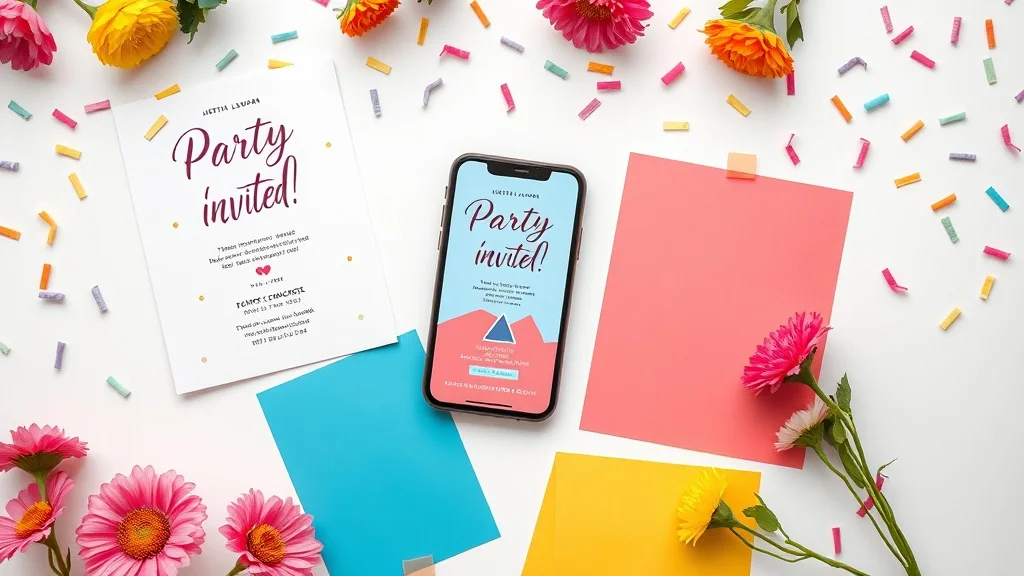
Good party invite ideas always cover the same core information, but great ones present that information in a hierarchy that guides the eye. Think about what your guest needs to know first, second, and third. The event name and date should dominate. Supporting details like venue and dress code come next. RSVP instructions close it out.
Here's what every invitation must include, in order of visual priority:
- Event name or occasion (birthday, wedding, engagement, etc.)
- Date and time (no ambiguity here)
- Location (address or venue name with a map link if digital)
- Host name (who's throwing the party)
- RSVP details (deadline, how to respond)
- Dress code (if applicable)
Digital invites let you go further. You can embed links, add interactive RSVP buttons, and even include countdown timers. These features turn a static design into something guests actually engage with.
Whitespace Is a Design Tool, Not Wasted Space
Crowding your invitation with text and graphics makes it harder to read and harder to feel excited about. Whitespace, the empty areas around your content, gives each element room to breathe. Guests should be able to glance at your invite and immediately know what's happening. If they have to search for the date, the design has already failed.
Invitation Design Tips for Digital Formats
Digital invites follow slightly different rules than printed ones. The most important difference is screen size. Most guests will open your invitation on a mobile phone, so every design decision needs to work at that scale. Text that looks great on a desktop mockup can become a blurry mess on a 6-inch screen.
Keep your core message visible without scrolling. The event name, date, and a clear visual hook should all land above the fold. Use high-contrast text on backgrounds so the details stay readable in different lighting conditions. And keep your file size in check because large images slow down load times, which frustrates guests before they've even read the invite.
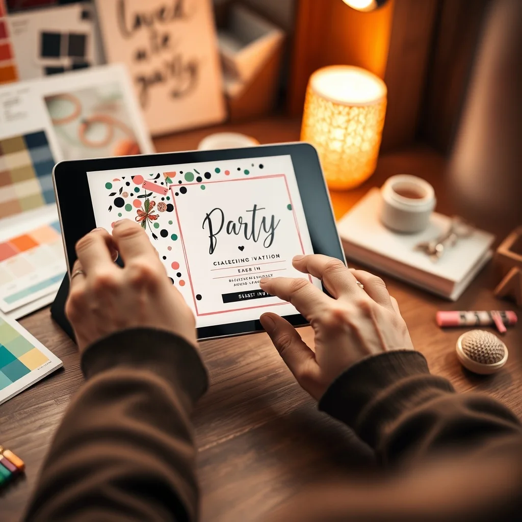
Use Templates as a Starting Point, Not a Finished Product
Invitation templates are a smart starting point because they handle layout and proportions for you. But the invitations that stand out are the ones that go a step further. Swap out the default colours for something that matches your event. Replace placeholder photos with something personal. Adjust the font weights to create a stronger visual hierarchy. Templates give you the structure; your customisation gives it personality.
Platforms like Invitofy offer customisable digital invite templates across every event category, from wedding invitations to corporate events. You get a professional foundation and full control over how it looks.
Animation and Motion in Creative Invitations
Subtle animation can make a digital invite feel premium without being distracting. A gentle fade-in, a soft shimmer on the event title, or a moving floral element draws attention in a way that static images cannot. The key word is subtle. Animation that loops aggressively or plays automatically with sound irritates guests rather than impressing them. Use motion to enhance, not to show off.
Common Party Invitation Design Mistakes to Avoid
Even people with good taste make the same invitation design mistakes. Knowing what they are means you can skip them entirely.
Too Many Fonts
Using four or five different typefaces in one invitation looks chaotic. Stick to two: one for headings and one for body text. If you want variety, play with size, weight, and spacing within the same font family instead.
Low-Quality Images
A pixelated background or blurry photo instantly makes an invitation look amateur. Use high-resolution images and check how they render at different screen sizes. If you're using a photo, make sure the text overlaid on it remains readable with enough contrast.
Missing RSVP Information
This happens more often than you'd think. Guests receive a beautiful invite with no clear way to respond. Include a deadline and a response method. With digital invites, an embedded RSVP button removes all friction and dramatically increases response rates. According to Wikipedia's overview of RSVP conventions, clear response instructions have been a cornerstone of formal invitations since the 18th century, and the principle holds just as true for modern digital formats.
Sending Without Testing
Always preview your invitation on a mobile device before sending it to anyone. What looks perfect in your design editor can shift, overflow, or break when it reaches a real phone screen. Send a test to yourself, open it in WhatsApp, check every detail, and only then send it to your guest list.
How to Use an Online Invitation Maker Effectively
An online invitation maker removes the technical barriers that used to make invitation design intimidating. You don't need design software or a creative background. But you do need a clear brief in your head before you start clicking around.
Decide on your event theme, colour direction, and key information before you open the tool. This keeps you from getting distracted by templates that don't fit your vision. Work from your concept outward, choosing templates that match your intended aesthetic rather than settling for whatever looks good at first glance.
Invitofy's platform lets you build creative invitations, send them directly via WhatsApp from your own number, and track RSVPs in real time. You can see exactly who's opened your invite and who has responded, which means no more chasing guests down for answers. Browse the full range of event invitation options to find a style that fits your occasion.
Final Thoughts on Party Invitation Design
Great party invitation design doesn't require a graphic design degree. It requires clear thinking, intentional choices, and attention to the details your guests actually care about. Pick a visual concept that fits your event, keep the layout clean, make the key information impossible to miss, and choose a format that looks sharp on mobile.
If you want to skip the frustration and create something that looks genuinely impressive, try Invitofy. Design your invitation, send it through WhatsApp, and watch the RSVPs come in without any of the usual back-and-forth.